
Look around at the businesses you actually remember. Chances are, it is not because their product was technically the best on the market. It is because something about how they showed up, their look, their voice, their personality, stuck with you. That is brand identity at work, and in 2026, with more businesses competing for attention than ever before, it matters more than it ever has.
A strong brand identity is not just a logo or a color palette. It is the complete visual and emotional experience someone has with your business, from the first time they see your name to the moment they become a loyal, repeat customer. Get it right, and people remember you, trust you, and choose you over competitors, even when your prices are not the lowest. Get it wrong, and even a genuinely great product can struggle to gain traction, simply because nothing about your presence gives people a reason to remember you.
In this guide, we will walk through exactly what brand identity means, why it matters more than ever this year, and a practical, step-by-step process for building one that genuinely stands out. Whether you are launching a brand new business or rethinking one that has felt stagnant for a while, this process applies equally well.
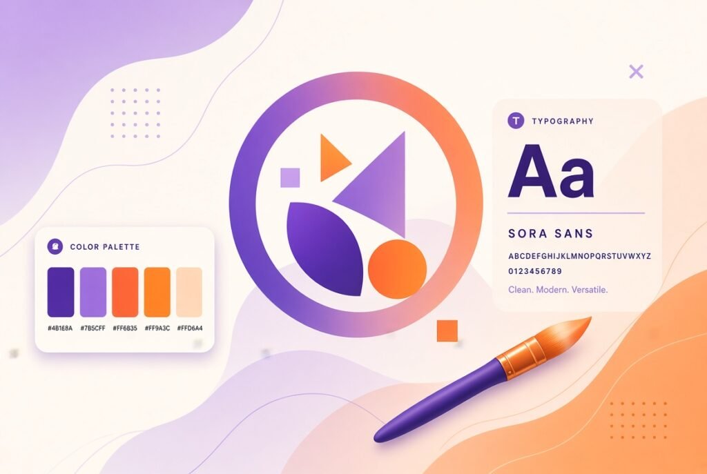
Brand identity refers to the collection of visual, verbal, and experiential elements that represent your business and distinguish it from competitors. This includes your logo, color palette, typography, imagery style, tone of voice, and even the way your team interacts with customers.
It is important to understand the difference between brand identity and brand image. Brand identity is what you create and control. Brand image is how people actually perceive you, based on their experiences. A strong brand identity strategy aims to align these two as closely as possible, so the perception people form matches the experience you intended to create.
Consider two businesses selling nearly identical products at similar prices. One has a clear, consistent identity that shows up the same way across its website, packaging, and social media, and speaks in a voice that feels genuinely like a person rather than a corporation. The other looks slightly different everywhere it appears, with no clear personality tying it together. Given the choice, most customers gravitate toward the business that feels more established and intentional, even if the underlying product is nearly identical. That gap in perception is entirely the result of brand identity.
One of the biggest mistakes businesses make is jumping straight into logo design before understanding who they are and who they are trying to reach. Your visual identity should be a direct expression of a clear strategy, not the starting point itself.
Your brand purpose answers a simple but important question: why does your business exist beyond making money? This is not about writing a lofty mission statement for the sake of it. It is about understanding the genuine value you bring to your customers’ lives.
Write down your answers honestly, without worrying about how polished they sound. This exercise often reveals a clearer sense of direction than business owners expect, and it becomes the foundation every other branding decision builds upon.
You cannot build a brand identity that resonates with everyone, and trying to do so usually results in a bland, forgettable identity that resonates with no one. Get specific about who you are trying to reach.
Consider factors like age range, lifestyle, values, pain points, and where your audience spends their time online. The more specific your understanding, the more targeted and effective your brand identity decisions will be.
Do not rely solely on assumptions. Talk to your existing customers, review analytics from your website and social media, and look closely at who is already engaging with your business.
Look at how other businesses in your industry present themselves. This is not about copying them, it is about identifying gaps and opportunities to differentiate.
Create a simple visual audit by gathering screenshots of five to ten competitor websites and social media profiles. Lay them out side by side and look for patterns. If every competitor uses blue and a clean, minimal aesthetic, that might be exactly the opportunity to stand out with a completely different visual direction, assuming it still aligns with your audience and brand purpose.
Before touching any design tools, define how your brand would behave if it were a person. This shapes everything from your color choices to your website copy to how your team responds to customer inquiries.
Your brand voice is how your personality comes through in written and spoken communication. It should remain consistent across your website, social media captions, email marketing, and customer service interactions.
Write a simple voice guide that outlines words and phrases your brand would use, along with ones it would avoid. This keeps your messaging consistent, even as different team members create content over time.
Imagine two fitness brands. One might use energetic, motivational language, full of exclamation points and phrases like “crush your goals” and “no excuses.” The other might use calmer, more encouraging language, focused on words like “progress” and “consistency” rather than intensity. Neither approach is wrong, but each attracts a genuinely different type of customer, and mixing the two inconsistently would confuse the audience either brand is trying to build.
With your strategy and personality defined, you are ready to move into the visual elements that most people associate with branding.
Your logo is often the first visual element people associate with your brand, but it should never carry the entire weight of your identity on its own.
Resist the temptation to overload your logo with too much detail or too many colors. The strongest logos tend to be simple enough to recognize instantly, even at a small size, such as a social media profile picture or a favicon in a browser tab.
Color plays a powerful psychological role in how people perceive your brand. Choosing a palette should go beyond simply picking colors you personally like.
Consider the psychological associations of different colors relevant to your industry and audience, while also ensuring your palette differentiates you from direct competitors who may already dominate certain color associations.
For example, blue is heavily associated with trust and is widely used across finance and healthcare industries, which means a new brand entering either space using blue as its primary color risks blending in rather than standing out. Choosing an unexpected but still appropriate color, paired with strong execution, often creates far more brand recognition than following industry convention.
Fonts communicate personality just as much as color does. A brand using a bold, geometric sans-serif font feels very different from one using an elegant, flowing script.
Beyond logos and colors, the photography, illustration, and graphic style you use across your marketing materials play a huge role in your overall brand identity.
Once your visual identity elements are finalized, document everything in a comprehensive brand guidelines document. This ensures consistency as your business grows and more people become involved in creating content and marketing materials.
A well-documented brand guide becomes an essential resource for designers, marketers, and even external partners working on your behalf, ensuring your brand identity remains consistent no matter who is creating the content.
A brand identity only becomes powerful through consistent, repeated exposure. Every place your business appears should feel unmistakably like you.
When your brand looks and sounds the same everywhere someone encounters it, it creates a sense of reliability and professionalism, even subconsciously. Inconsistent branding, on the other hand, can make a business feel disorganized or untrustworthy, even if the actual product or service is excellent.
Think about how many times a customer needs to see your brand before they truly remember it. Marketing research has long suggested that repeated, consistent exposure is what builds recognition, often referred to as the mere exposure effect. If your logo, colors, and voice shift slightly every time someone encounters your business, you are essentially resetting that recognition process each time, making it far harder for your brand to stick in someone’s memory.
While timeless design principles remain important, staying aware of current trends can help your brand feel fresh and relevant without losing its core identity.
While it is worth being aware of these trends, treat them as inspiration rather than a checklist to follow exactly. A brand identity that chases every trend simultaneously often ends up feeling scattered rather than distinctive. Choose the trends that genuinely align with your brand personality and audience, and let the rest go.
Another mistake worth calling out separately is treating brand identity as a one-time project rather than an evolving discipline. Your business will grow, your audience will shift, and the market around you will change. A strong brand identity should be revisited periodically, not to chase every new trend, but to ensure it still authentically represents who your business has become.
Building a brand identity that genuinely stands out in 2026 requires more than a nice-looking logo. It requires a clear strategy, a defined personality, thoughtful visual design, and consistent application across every single touchpoint your customers encounter.
Businesses that invest the time to get this right do not just look more professional. They build genuine recognition, trust, and loyalty that compound over time, making every other marketing effort more effective as a result.
Ready to build a brand identity that truly reflects your business? Get in touch with our team. We help businesses develop cohesive, memorable brand identities from strategy through to final execution.
Building a brand people remember does not happen overnight, and it rarely happens by accident. It happens through deliberate choices made consistently over time, guided by a clear understanding of who you are and who you are trying to reach. Start with strategy, follow through with intentional design, document everything, and stay consistent. That combination, more than any single trend or tool, is what separates brands people forget from brands people genuinely love.
1. What is the difference between a logo and a brand identity?
A logo is just one visual element within a brand identity. Brand identity encompasses your logo, color palette, typography, imagery style, tone of voice, and overall personality across every customer touchpoint.
2. How much does it cost to create a brand identity?
Costs vary widely depending on the scope of work, ranging from a few hundred dollars for a basic logo and color palette to several thousand dollars for a comprehensive brand strategy and full visual identity system.
3. How long does it take to develop a complete brand identity?
A thorough brand identity process, including strategy, design, and guideline documentation, typically takes anywhere from four to eight weeks, depending on the complexity of the business and the number of revision rounds involved.
4. Should I hire a professional or design my brand identity myself?
While tools exist for do-it-yourself branding, hiring a professional designer or agency generally results in a more strategic, polished, and differentiated identity, particularly for businesses serious about long-term brand recognition.
5. How often should I update my brand identity?
There is no fixed timeline, but many businesses refresh their visual identity every five to seven years to stay current, while avoiding changes so frequent that they undermine brand recognition.
6. What makes a brand identity memorable?
Memorable brand identities combine distinctive visual elements, a clear and consistent personality, and genuine differentiation from competitors, all reinforced through consistent application across every touchpoint.
7. Can a small business have a strong brand identity without a big budget?
Yes. A strong brand identity depends more on clarity, consistency, and strategic thinking than on budget size. Many well-known brands started with modest resources but maintained disciplined consistency from day one.
8. Do I need brand guidelines if I am a solo business owner?
Yes, even solo business owners benefit from documented brand guidelines, since they ensure consistency over time and make it easier to onboard freelancers or team members as the business grows.
9. How does brand identity affect customer trust?
A consistent, professional brand identity signals reliability and competence, which builds trust subconsciously. Inconsistent or unpolished branding can create doubt, even if the underlying product or service is high quality.
10. What is the first step in creating a brand identity?
The first step is defining your brand strategy, including your purpose, target audience, and competitive positioning, before moving into visual design elements like logos, colors, and typography.