
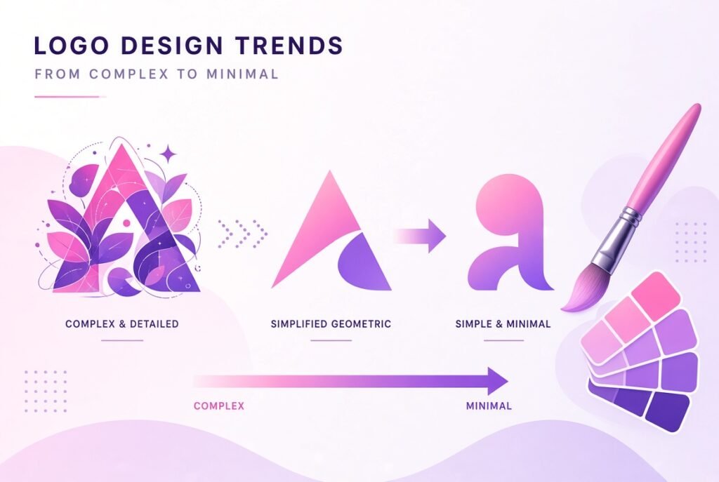
A logo is often the very first visual impression a brand makes, and design trends shift constantly as tastes evolve and technology changes. This guide breaks down what is currently gaining popularity in logo design, and what is quietly fading away, so you can make informed decisions whether you are designing a new logo or refreshing an existing one.
Trends do not mean you should completely reinvent your logo every year, but understanding current design direction helps you avoid looking outdated. A logo that feels stuck in a past era can unintentionally signal that a brand has not evolved either. At the same time, chasing every trend blindly can weaken brand recognition. The goal is to find a balance between staying current and maintaining a timeless identity that customers can recognize instantly.
Certain styles have gained strong momentum recently, driven by shifts in digital design, minimalism, and cultural taste.
Simplicity continues to dominate logo design, and this trend shows no signs of slowing down.
Brands are stripping away excessive detail, gradients, and complex illustrations in favor of clean shapes and simple lines. A simplified logo tends to scale better across different platforms, from a tiny app icon to a large storefront sign.
Flat design, which avoids heavy shadows or three dimensional effects, remains popular because it looks clean on digital screens and adapts easily across devices.
Typography is taking center stage in many modern logo designs.
Interestingly, alongside minimalism, a retro influence has also emerged, with brands blending vintage color palettes and playful shapes into otherwise modern designs.
Muted, warm tones inspired by past decades are being combined with modern layouts to create a sense of familiarity mixed with freshness.
Rounded edges and quirky geometric shapes reminiscent of older design eras are being reintroduced in a more polished, contemporary way.
As brands operate across many different platforms, logos need to adjust accordingly.
Many brands now design several versions of their logo, including a simplified icon for small spaces and a fuller version for larger displays.
With more content consumed on digital platforms, subtle logo animations are becoming increasingly common, particularly in video intros and app loading screens.
A shift toward using fewer colors, sometimes just one or two, has become popular. This approach creates a more sophisticated and versatile look that works well across different backgrounds and materials.
Logos that incorporate slightly imperfect, hand drawn elements are being used to convey authenticity and a personal touch, especially among smaller and artisan brands.
Just as certain styles rise in popularity, others fade, often because they start to feel overused or dated.
Highly detailed illustrative logos with intricate scenes are becoming less common. These designs often lose clarity when scaled down, which makes them impractical for modern digital use.
Logos that rely heavily on shiny, three dimensional effects or dramatic gradients are being replaced by flatter, simpler alternatives that feel more current and versatile.
Symbols that feel generic or overly familiar, such as commonly reused icon shapes, are losing appeal as brands seek more distinctive visual identities.
While elegant script fonts were once extremely popular, especially for lifestyle and beauty brands, overuse has made them feel less unique. Many brands are shifting toward custom typography instead.
Logos using too many colors at once are becoming rarer, as brands recognize that limited, intentional color choices create a stronger and more memorable identity.
Not every trend suits every business, so it is important to evaluate trends against your brand identity rather than adopting them simply because they are popular.
A playful, retro inspired logo might work well for a casual food brand, while a law firm may benefit more from a clean, minimalist wordmark that conveys professionalism.
Ask whether a particular style will still feel relevant in several years, or whether it is likely to feel dated quickly. Logos are a long term investment, so timeless elements should still take priority over passing trends.
Before finalizing a design, test how it looks as a small app icon, a large banner, and in black and white. A strong logo should remain effective across all these formats.
Logo design trends offer useful direction, but the strongest logos are built on a foundation of clarity, versatility, and genuine brand relevance rather than trend chasing alone. Use current trends as inspiration, but always filter them through the lens of what truly represents your brand and what will remain effective for years to come. A thoughtful balance between modern appeal and timeless design principles will always outperform a logo built purely to follow passing fashion.
How often should a brand update its logo?
There is no fixed rule, but many brands consider a refresh every several years, generally when the current design starts to feel outdated or no longer represents the brand accurately.
Are minimalist logos better than detailed ones?
Minimalist logos generally perform better in terms of versatility and scalability, although detailed logos can still work well depending on the brand and its specific use case.
Why are animated logos becoming popular?
Animated logos are gaining popularity because more content is consumed digitally, and subtle motion helps brands feel more dynamic and modern across video and app platforms.
Is it necessary to follow logo design trends?
Following trends is not mandatory, but staying aware of current design direction helps ensure a logo does not feel outdated compared to competitors in the same industry.
What makes a logo timeless rather than trendy?
A timeless logo typically relies on simple shapes, balanced typography, and a clear concept rather than decorative elements that are closely tied to a specific design era.
Why are script fonts becoming less popular in logo design?
Script fonts have become less popular partly due to overuse across many brands, which has reduced their ability to make a design feel unique or distinctive.
Should small businesses follow the same logo trends as large brands?
Small businesses can certainly draw inspiration from current trends, but the design should always be adapted to fit their specific audience, industry, and brand personality.
Why is scalability important in logo design?
Scalability ensures a logo remains clear and recognizable whether it appears as a tiny icon or a large printed sign, which is essential for consistent brand representation.
What is the difference between a wordmark and a symbol based logo?
A wordmark relies primarily on stylized text to represent the brand, while a symbol based logo uses an icon or graphic element, sometimes paired with text, to create recognition.
How can a business test if a new logo design is effective?
A business can test a logo by viewing it at different sizes, on different backgrounds, and in black and white, as well as gathering feedback from target customers before finalizing the design.